Building your design system in Figma

Sebastian Reed
Lead designer
Date
2. juli 2025
Date
2. juli 2025
If my preferences in any way mirror the feelings of other designers in the current design landscape, you probably hate opening a Figma file to find just a blank canvas. Or, even worse, a canvas overflowing with elements from an untidy design system stemming from decades of different design files.
Building a solid design system takes work. It requires time and often a lot of fine-tuning. So, where do you even start?
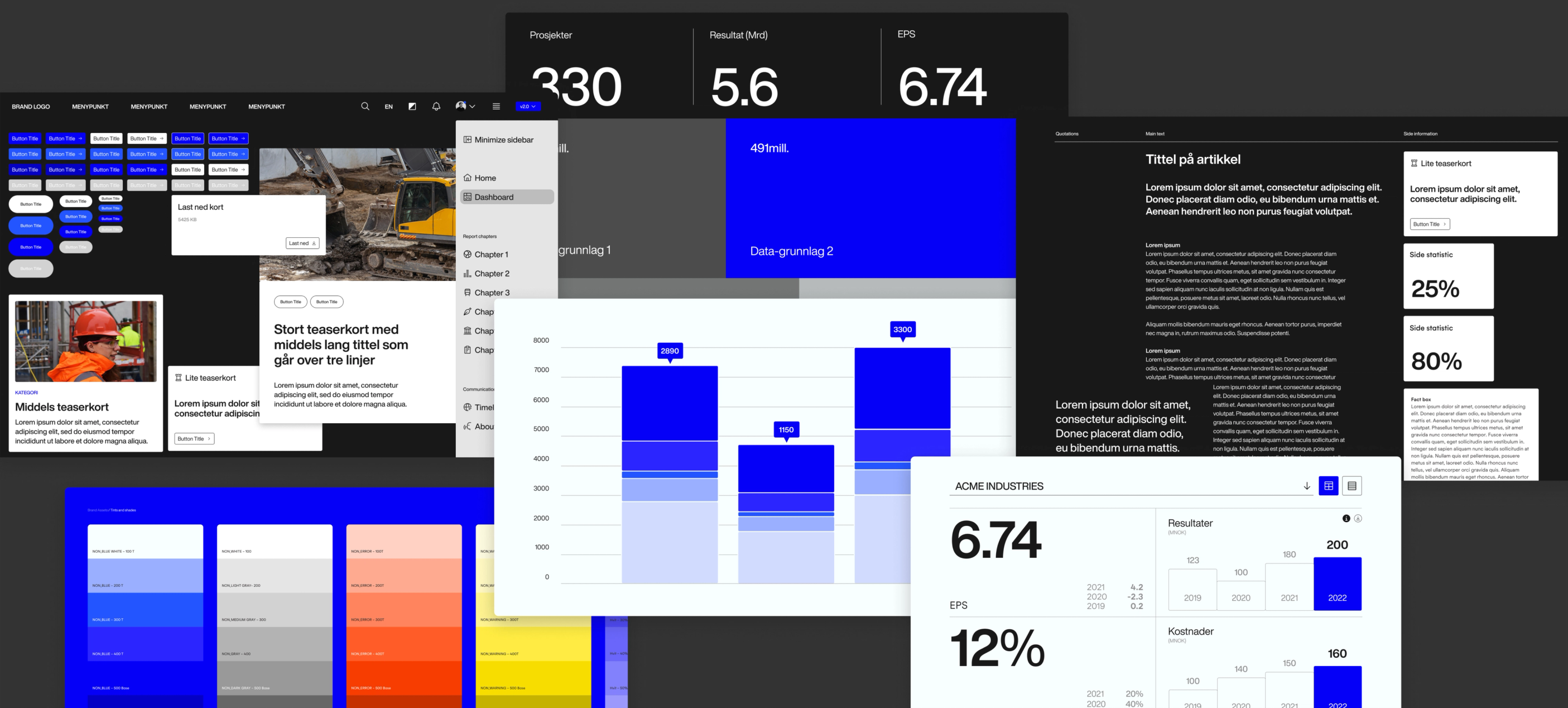
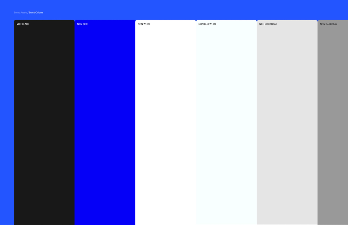
First, you should define a flexible colour system with an extended gallery of UI and interactive colours
Every design system should have its colours; at the centre of these, you should define and keep your brand colour. Integrating your brand palette of colours in the UI is always a good idea, as these support foundational recognition of your digital formats.
Following the foundational principle of good UX design, users should be able to decode the meaning of UI objects just by looking at them. You will need to distinguish static and interactive objects, as well as different standard states, and to do this, you most likely need to add extra colours. Try to be restrained when introducing new colours for UI; your brand should come across the same way in UI as in other non-digital formats.
Use brand colours for functional and decorative elements on websites and apps. They can also structure and give character to your design throughout, for example, headers, footers, menus, etc.
Defining your denotive colours
Denotive colours are colours that mean something. You'll need colours for positive (success) and negative (error and warning) states. You might get away with using brand colours for positive experiences—users will associate your brand colour with a positive outcome. For warnings and errors, however, I recommend going with new, defined colours that you don't often see used in the brand elsewhere to give them the required emphasis and contain their associated feelings of problems outside your brand playground.
For added future-proofing, create denotive colours whose contrasts work well in light and dark modes.
Defining your tints and shades (interactive colour library)
Once you have added your base and denotive colours, expand these with varying tints (lighter variants) and shades (darker variants) for interactive elements. The shades and hues can help convey different states for UI elements—for example, a pressed state, hover state, or disabled state.
You can create varying tints and shades from the base colour by tweaking the brightness and saturation through the HSL/HSB option inside your colour panel in Figma. This process is time-consuming but usually results in better colours than generative ones.
Use the same colours for the states of links and buttons to help your users recognise similar interactive elements.
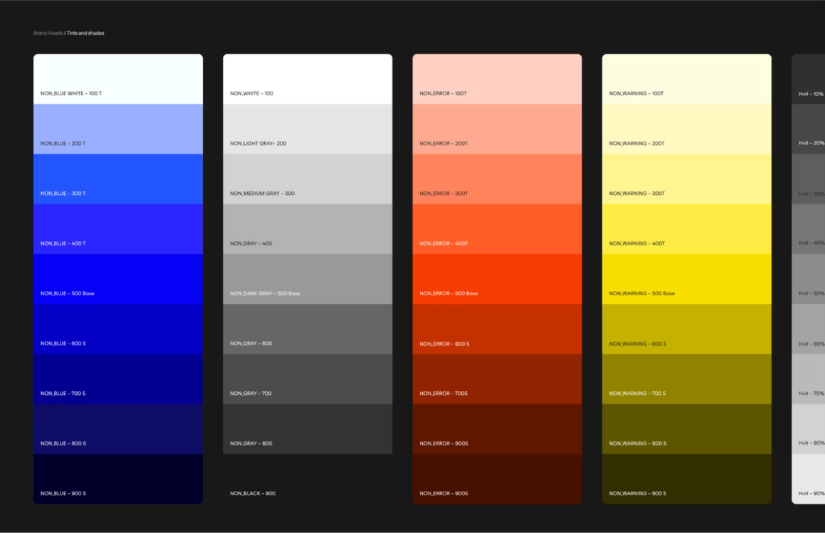
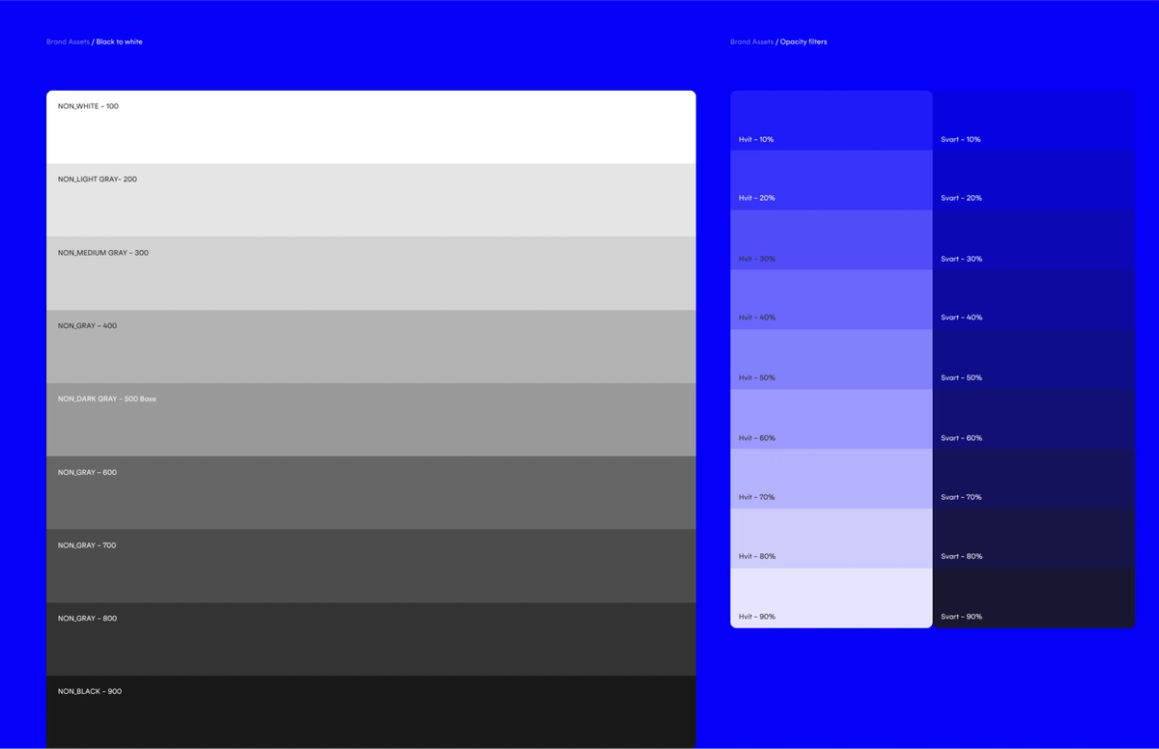
Defining your blacks, greys, and whites
Defining your base black-and-white and the varying shades of grey in between is an absolute must. You usually need colours like these for the background of articles and text, and the greys to create an emphasis hierarchy and even show something that's disabled or out-of-date.
I recommend setting both your blacks and whites with varying degrees of opacity. These variants are perfect for placing an icon over an image, controlling how much or little of the colour or image leaks through, and for filters that can put text over images.
I want to pitch one last tip before moving on — keep a simple naming convention, such as:
- Brand/Primary Colors
- UI Colors
- Tints and shades
- Folder for tints of each colour
- Opacity filters
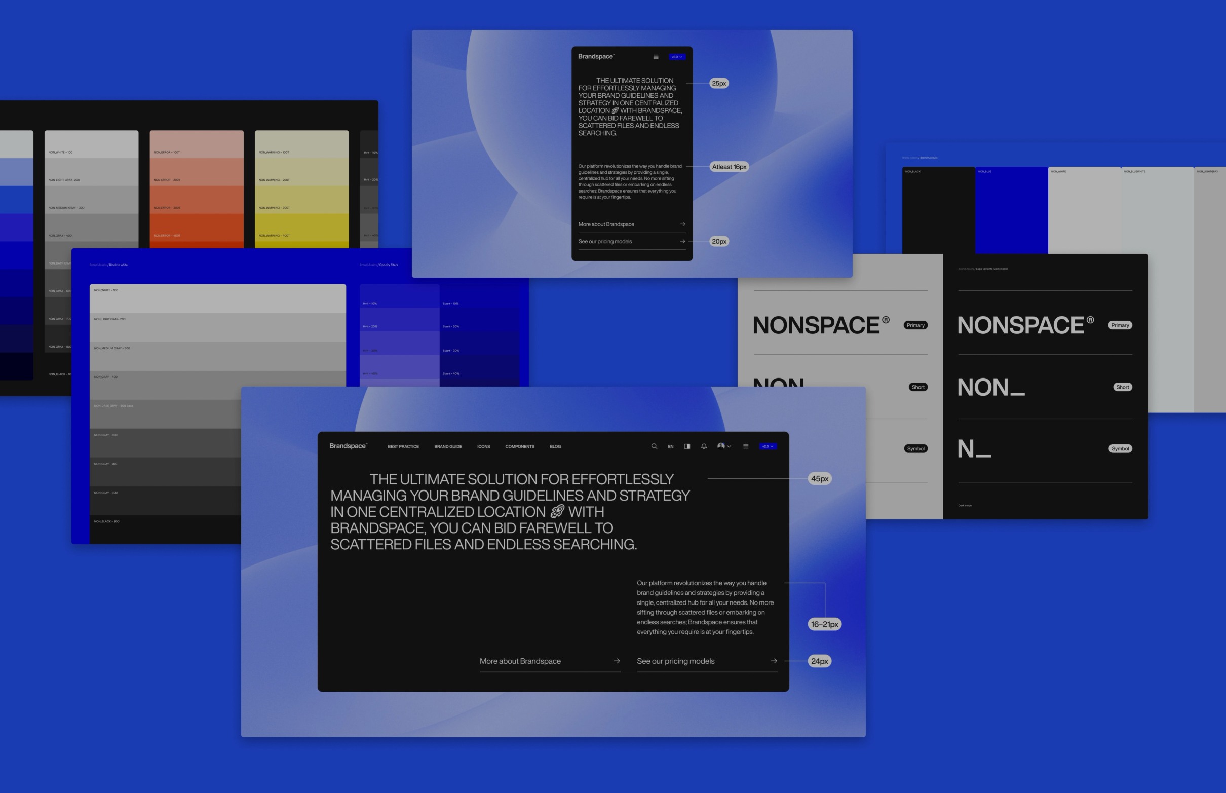
Create a flexible typography system for desktops, tablets, and mobile devices
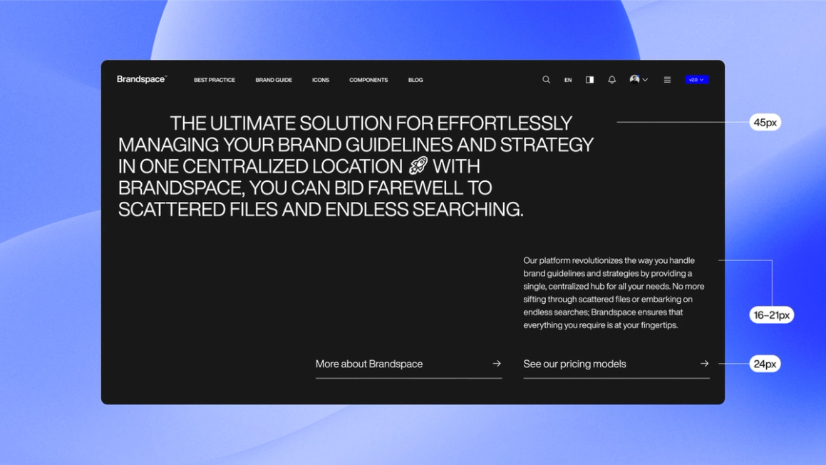
How you set up, scale and let your typographical system behave can make or break your entire digital design. You must pick a good font for your website and the correct sizes to use for your font. There should be enough contrast to help users focus on the key messages and enough flexibility to view everything from your laptop to your smartphone – maybe even, at some point, your smartwatch, too.
This flexibility demands either a very large or a very smart hierarchy. What I've set up for this article is extensive and hopefully bright. I'm sure you'll have your thoughts on improving what I've set up here, and that's fine. As I said, there is no one-size-fits-all system.
The way I've organised this system is by six more extensive categories;
- Display styles
- Headlines
- Lead
- Body
- Information
- Button
Setting up your font sizes for desktop
Regarding your other styles, it is often wise to define your body text. The general best practice for body text on the desktop is that it should usually lay around 16–21px, depending on what provides a pleasant reading experience. Keep in mind that if you want smaller information text for the likes of fact boxes, small facts, tags, etc., you should leave some room for yourself to define these smaller than your body text without going to illegible sizes.
Going further into the leads, subheadings, and headlines can be done mathematically in equal increments. It could be an increase in a set volume of pixels or rem or using a ratio like 1.2. This should make it easy to flesh out the sizes for the rest of the hierarchy based on your chosen body text. However, even after all these initial tweaks, you may look at your screen and think, «This should be slightly bigger/smaller». Follow your gut and intuition to tweak it beyond the mathematical numbers. After all, no one else will bother checking your increments, at least as long as they look clean and legible.
Input fields and buttons should match closely with those of your body text.
Display styles would be the text used strictly for emotional messages and hero text. These hierarchies could be the most interesting ones to play with beyond the rules and conventions. Play around with the sizes until you find something that works well for your font. These could also be further disconnected from whatever incremental or modular scaling system you use for the other type styles.
In addition, I usually set up everything from the lead and down with two smaller sizes (medium and small), which are the standard sizes for tablets and mobile phones.
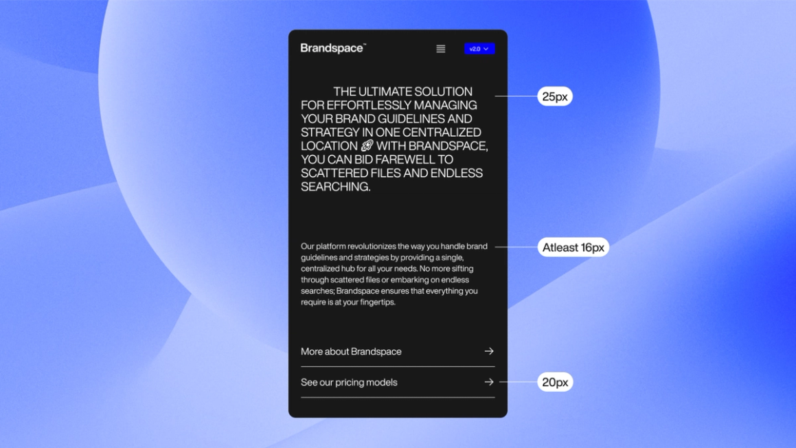
Setting up your font sizes for mobile and tablet
Your body text should usually be at least 16px on mobile. However, sometimes you could argue with going even smaller (for example, if a typeface has giant characters). Still, beyond the threshold of 14px, the text will almost always become hard to read. After defining your body text, flesh out those incremental values, and rinse and repeat for tablets. Make sure your typography styles feel the same to your eye as your initial hierarchy. Add your preferred method for scaling between styles to add extra responsiveness.
Use the plugin Batch Styler for Figma to quickly change multiple styles simultaneously.
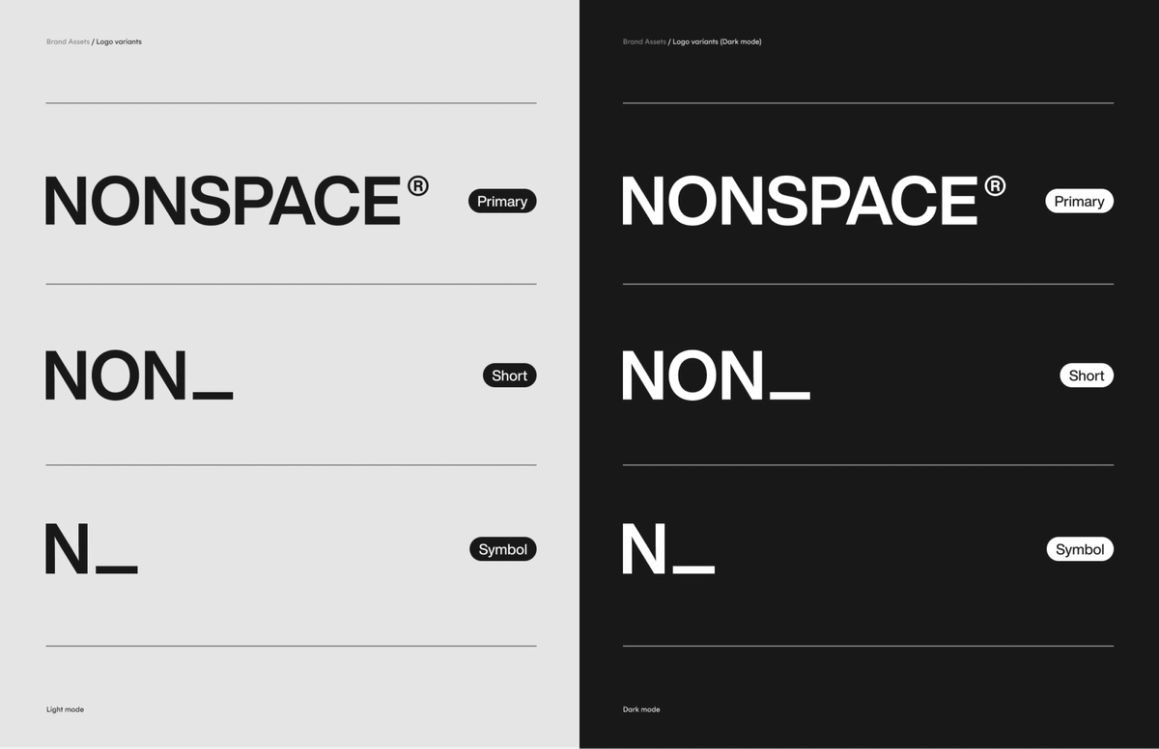
This file should be a relatively minimal system where the rules for logo usage are shown clearly in the components created. Usually, there should be at least;
Primary logos:
- Logo in primary colour
- Logo for dark mode
Logo symbols:
- Logo symbol for use where full logo is too long/large
- Logo symbol for dark mode
Additionally, you should add any other variants you use throughout the UI/UX. However, you should keep the logo system as small and tight as possible.
What is pertinent is the calmness of that beauty, its sense of restraint.
Kazuo Ishiguro, NovelistIt should indeed be as if your logo component library knows of its own beauty and greatness, and it should feel no need to shout it out.
This way, in the event that your logo should change (and lets be honest it probably will at some point), this allows for a company-wide rollout simply by changing these main components.
Create your global grid system/s
What would the web be without grid systems? I'll let you imagine whatever horrid scenario comes to mind here. (I'm not saying this should never be challenged, but I love a neat and flexible grid as much as the next designer). Grid systems with a branded touch add the last bit of consistency and personality your digital solution needs. This could be one grid to rule all digital formats or one optimised for desktop, one for tablet and one for mobile. It could be something other than these options as well.
Implement your chosen icon library, or make your brand icons a global component library
Your favourite icon libraries usually have Figma files readily available for download.
This subhead says it all. The Figma files exist as official Figma kits from the icon creators or files created by the design community. These make it easy to distribute your icons globally throughout your FigJam and Figma design files. As for the choice of icon sets, choose what matches or contrasts your other identity elements in a way you like.
Pushing your system further
With the basic elements in place, creating consistent UI/UX components should be easier. Just remember to implement the best ones into a system to reuse them. If built on a solid foundation (which you should have now), this ever-growing library will become better and better with time, solidifying the initial work you put in even further.
Never having to open a file to once again have to set up grids, font sizes, colour styles, or sources for your icons online is a particular delight for the UI/UX designers, the clients, and people you set it up for.
Do you have questions or want to discuss establishing a solid system for your organisation?